What are Sparklines?
Sparklines were introduced in Microsoft Excel 2010 and add a quick way to display results without having to insert an entire chart object. A sparkline displays a visual representation of data as a tiny chart inside a single cell, and can be used to show trends in a series of values, such as sales for a company, products, sales representatives, time frames, economic cycles, or pretty much anything that has discernible increases or decreases.
Is a Sparkline a Chart Object?
The tiny sparkline chart actually resides in the background of a cell and displays a separate result in each cell for the range selected, unlike the chart object that displays all results in a single chart, such as a column, bar, pie, or a myriad of other chart types.
There are three different sparkline chart types, found on the Insert tab:

Create a Sparkline Chart
Because sparklines live in the background of a cell, you can insert them anywhere on your worksheet. However, people wouldn’t have a clue what they were supposed to represent as the Formula Bar is blank for any cell that contains a sparkline, unless you enter something else in the cell. Ergo…Best to put them next to your data.
Sparklines are automatically grouped by default but you can ungroup them to treat the cells separately. When you insert the chart, you can click in the first cell where you want the chart, and then select the rest of the range when inside the dialog box, or easier method, select the range first, and it will be auto displayed in the box:

Click Insert tab to display the dialog box. If you have selected all the cell references for results, the Location Range is filled in and the Data Range: box is waiting for you to select the value cells:

Select the full range with the mouse of the values you are charting (in this case, B4:E8):

Click OK to insert the mini-charts.

Note: If you only selected the one cell, F4, when you inserted the sparkline, you can use the Fill Handle to populate the rest of desired cells. (You must drag the handle down though as the double click shortcut will not work here).
The Design Tab for Sparkline Tools
You don’t have all the fancy trappings of actual Excel chart objects but, hey, these are pretty spiffy and sometimes can even get the picture across in a clearer manner. The Sparkline Tools tab gets added to the end of the Ribbon and gives you many options for editing and formatting those little gems through the Design tab.

You probably noticed that no markers displayed on the line charts but you can easily add them. (They are available only on this chart type). In the Show group, just click in the Markers box, and there you go – a marker for each change in value. Now you can use the Style group to choose a quick color change or individually change the Sparkline Color or Marker Color. (See below). Individual markers are also available for any chart type to represent High, Low, Negative, etc., in the Show group.
You can apply a color scheme to your sparklines by choosing a built-in format from the Style gallery or change your chart type from the Design tab (available when you select a cell that contains a sparkline). You can use the Sparkline Color or Marker Color commands to choose a color for the high, low, first, and last values (such as green for high, and orange for low).
Whatever selections you make are applied to all the sparkline cells as they are grouped by default. If you want to personalize a particular cell, or all cells individually, they can be ungrouped, and you can also type a comment directly in the cell without deleting the chart.
Ungroup Sparklines
Ungroup all the sparklines by selecting that range, and choosing Ungroup from the Group group. (I’m not stuttering, honest)! If you just want to personalize one cell, select it, and choose Ungroup.

Using Sparklines for Stock Performance
This image shows a column sparkline in cell F2 and a line sparkline in F3. Both of these sparklines get their data from cells A2 through E2 and display a chart inside a cell that shows the performance of a stock. The charts show the values by quarter, highlight the high value (3/31) and the low value (12/31), show all the data points, and show the downward trend for the year. The high value marker is green, and the low value marker is orange. All other markers are shown in black.

Cell F6 shows the 5-year performance for the same stock, but displays a Win/Loss chart that shows only whether the year had a gain or a loss. This sparkline uses values from cells A6 through E6.
Sparkline Benefits
Sparklines can be inserted next to the data and take up such little space. They also easily point out a pattern. Any edits to your data automatically update the chart so the changes to trends are instantly represented. They can be inserted for rows or columns of data, and type changed with a mouse click.
*Stock Performance image from Microsoft
Find Sparklines fascinating? What would you use them for? Leave a comment below!
If you like different graphical ways of displaying your data, check out my blogs on using the Camera tool in Excel:
Part 1… https://gaylelarson.com/use-excel-camera-tool-combine-objects-several-workbooks/
Part 2…https://gaylelarson.com/excel-camera-tool-part-2/

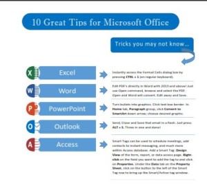 Click to download great tips to speed up your Office projects.